

UX-UI WEB DESIGN
Creating a More Accessible Platform for Employment
At Skill Squirrel, a platform issuing non-academic credentials to validate skills and bridge employment gaps, I contributed to key projects, including:
Additionally, I helped evolve the web design system to support scalability and future growth.
ROLE
Research
UX Design
UI Design
Copy Write
TOOLS
XD
Illustrations
TIMELINE
May - Aug 2023

“Li has the ability to pay extraordinary attention to detail. Her work is thoughtful and thorough. It has been a great pleasure to have Li with us this summer. She has worked collaboratively with her teammates, and she has been a very productive worker. Her dedication to her work will serve her well on her chosen career path.”
— Kathleen Webb President at Skill Squirrel
01
Digitalizing Physical Demand Analysis Form
On the platform, the process surrounding Physical Demands Analysis (PDA)—a critical document for job postings—was cumbersome and time-consuming. Employers struggled with downloading, inputting, and uploading forms, while job seekers faced delays in accessing relevant information. This created friction in connecting job seekers and employers seamlessly.
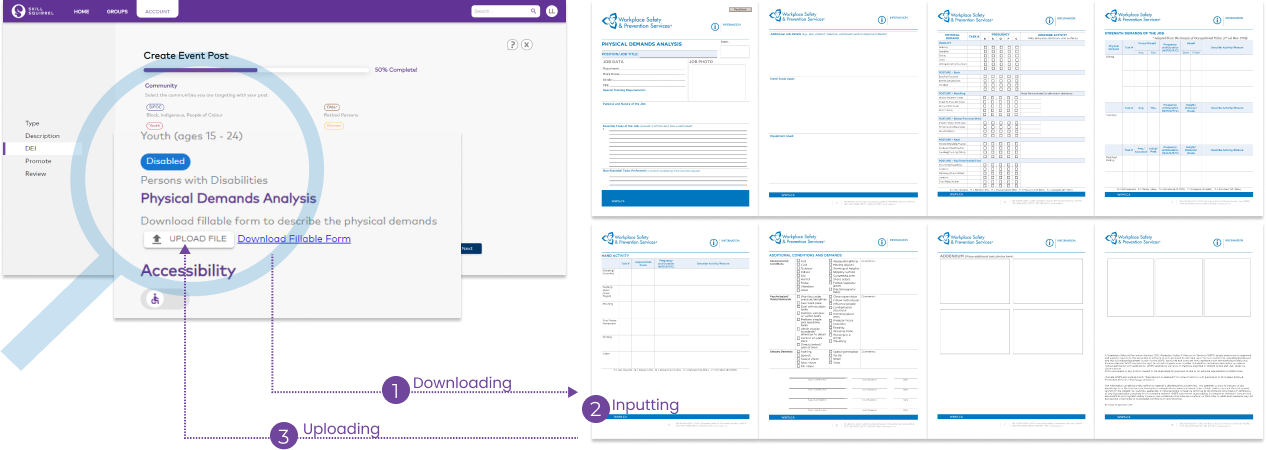
To simplify the operation process and facilitate meaningful connections between employers and job seekers, I conducted research to uncover their needs. Key findings highlighted they need direct PDA access, simplified workflows for viewing, editing and sharing, and intuitive navigation for quick information retrieval.
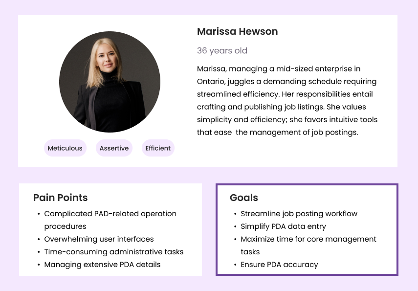

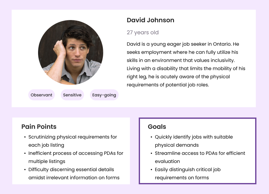

Leveraging user insights, I designed an interactive PDA interface tailored for employers and job seekers. This centralized hub streamlined PDA access and management, eliminated redundant paperwork, and optimized the process for speed, efficiency, and clarity, providing users with a comprehensive overview.
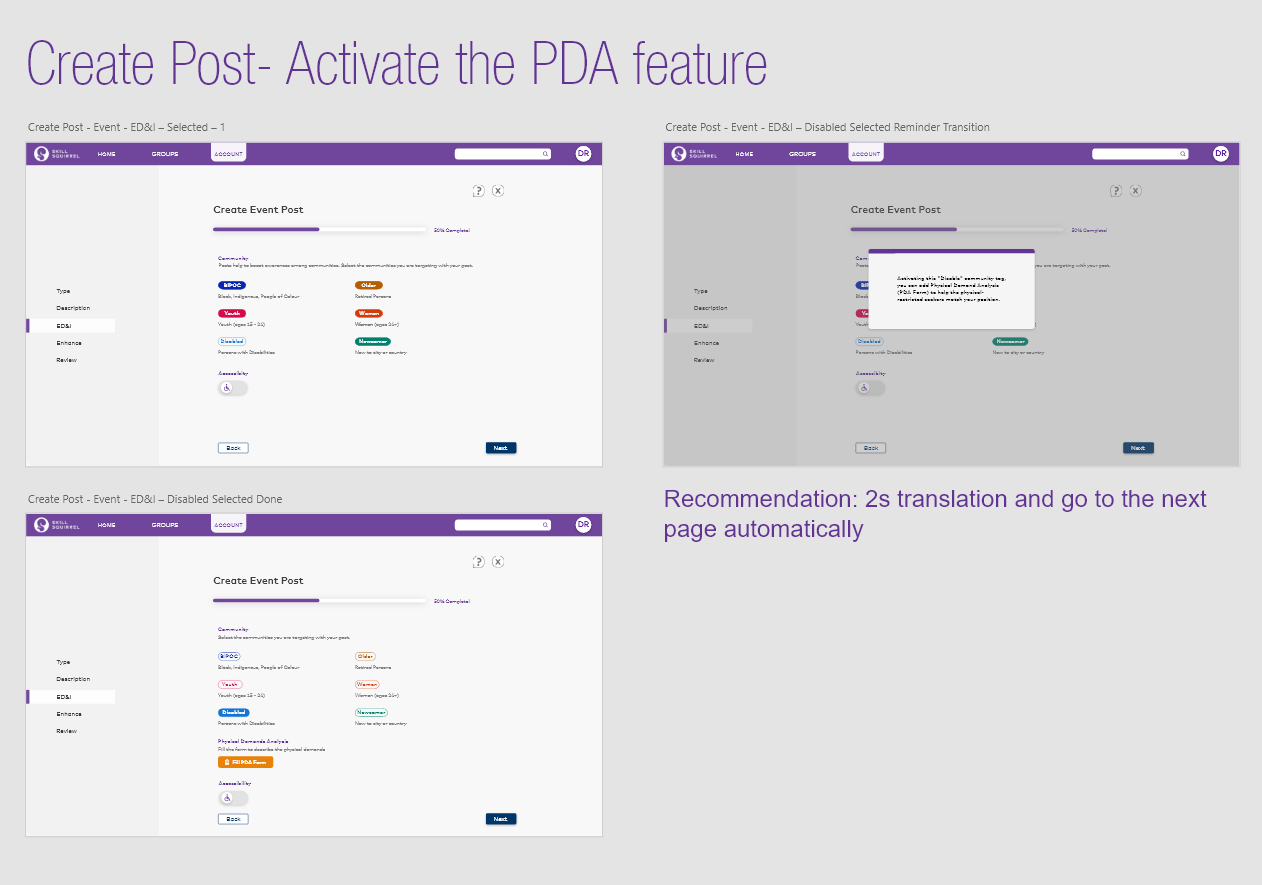
01 • The PDA feature activates automatically when the “disabled” tag is selected during job post creation.
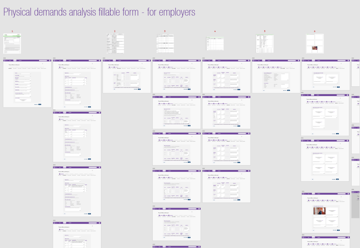
02 • Step-by-step workflows with contextual guidance enable seamless online completion and submission.
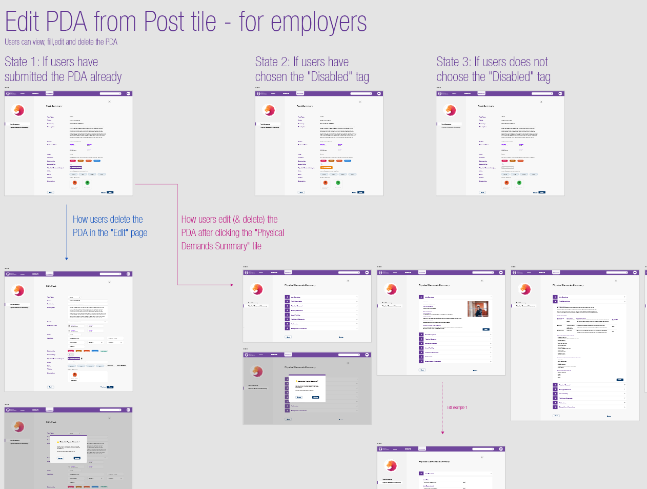
03 • Employers can easily edit or delete existing PDAs information to adapt to changing requirements.
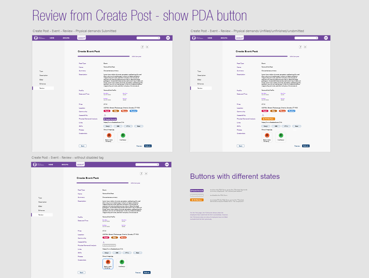
04 • PDAs function can be reviewed and edited directly from the Post Creation Board, with optimized tools for quick updates.
01 • A dedicated PDA button on relevant postings enables job seekers to access the PDA form directly.
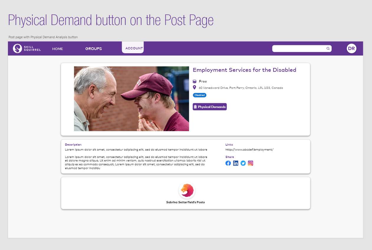
02 • View the complete PDA requirements with the flexibility to focus on specific sections of interest.
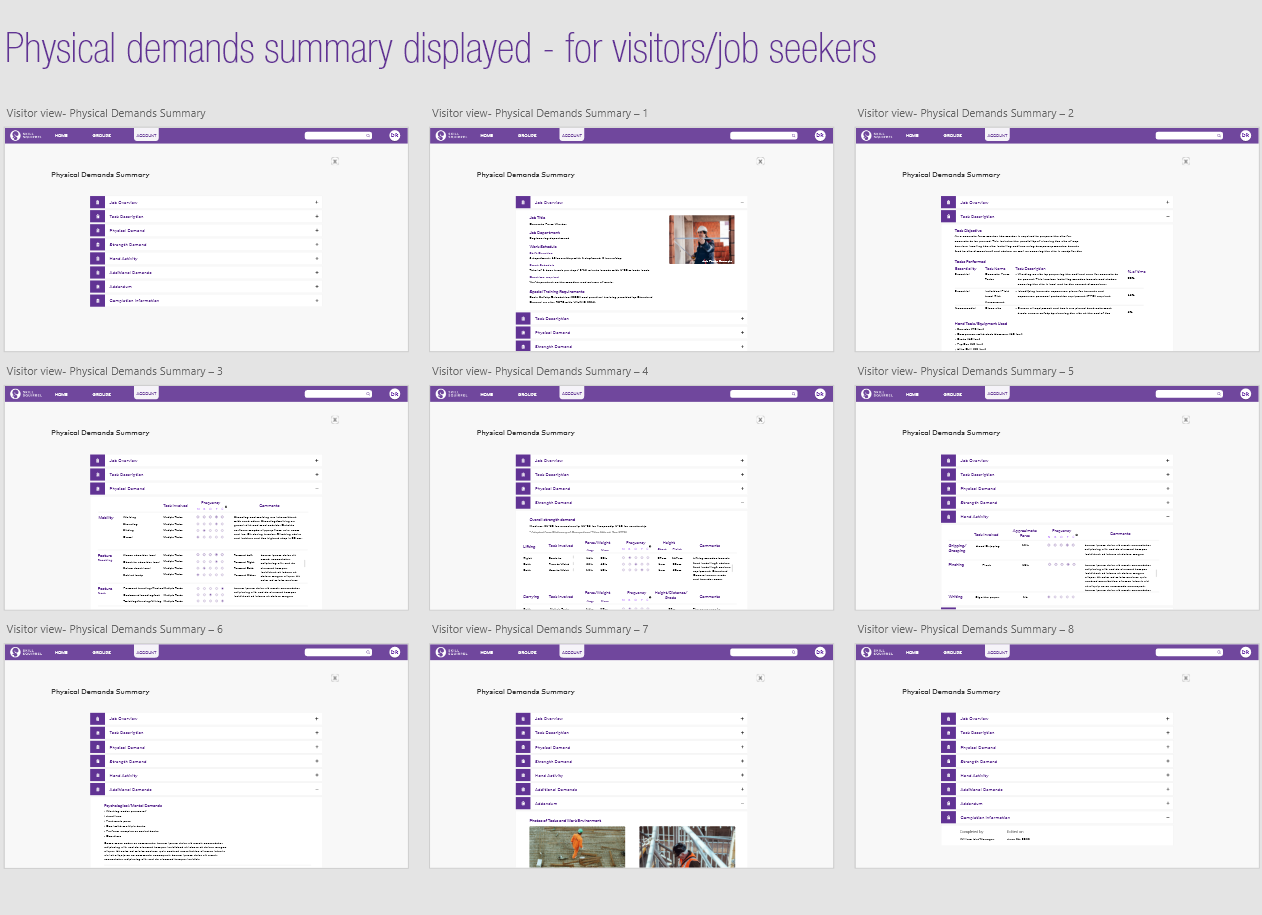
The solution significantly achieved measurable improvements:
• Employers reported faster job posting times and clearer workflows, reducing errors and delays.
• Job Seekers experienced seamless access to PDA information, boosting their confidence in finding suitable roles.
• The platform saw a 40% increase in PDA task completion rates.
For Employers
For Job Seekers
02
Redesigning Account Interfaces
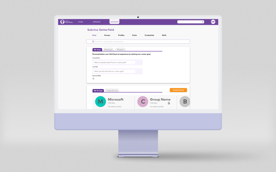
The original user account interface struggled with unclear categories, inconsistent layouts, and disorganized integration of features. These issues caused user confusion, dissatisfaction, and inefficient access to critical information, detracting from the overall user experience.
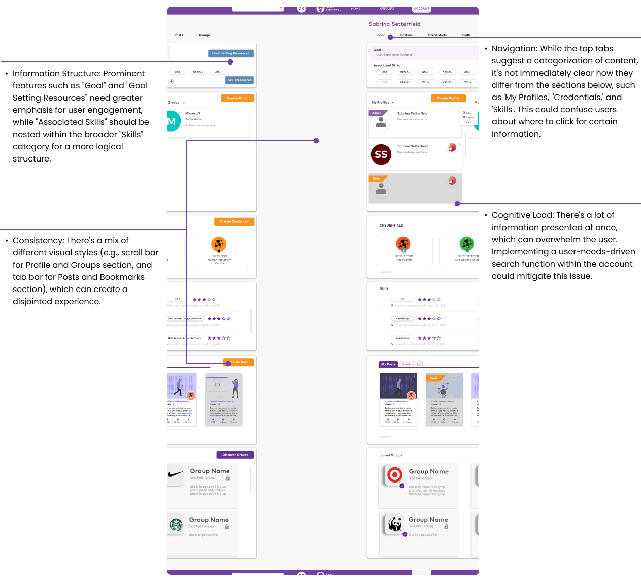
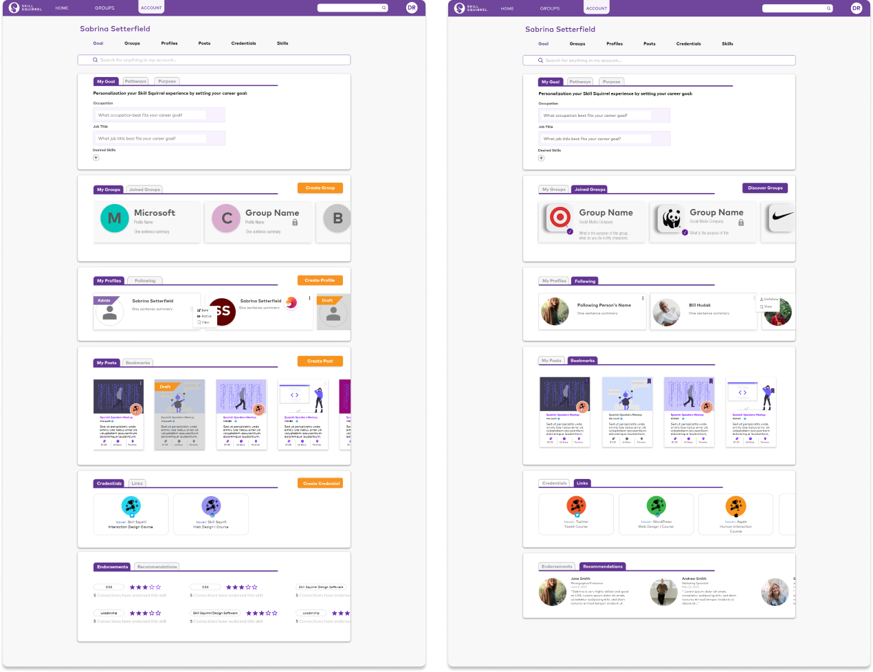
The redesign aimed to refine the account page for clarity, efficiency, and functionality. The goal was to create a well-organized, user-friendly interface that seamlessly integrates features while enhancing usability and engagement.
• Logical Organization: I reorganized the content into well-defined categories with uniform tabs, simplified the layout and minimized user confusion.
• Enhanced Search Functionality: I introduced a global search feature to the account page, allowing users to quickly locate specific information.
• Integration of New Features: Based on stakeholders’ new needs, I integrated external link credentials and recommendations, aligning them with the existing design system for a cohesive user experience.
03
Onboarding Pop-Up Experience
The project aimed to effectively showcase Skill Squirrel’s values and core features, providing users with a clear understanding of the platform to enhance their initial experience and encourage conversions. My role was to articulate the platform’s value and functionality, complemented by my teammate’s engaging squirrel mascot illustration.
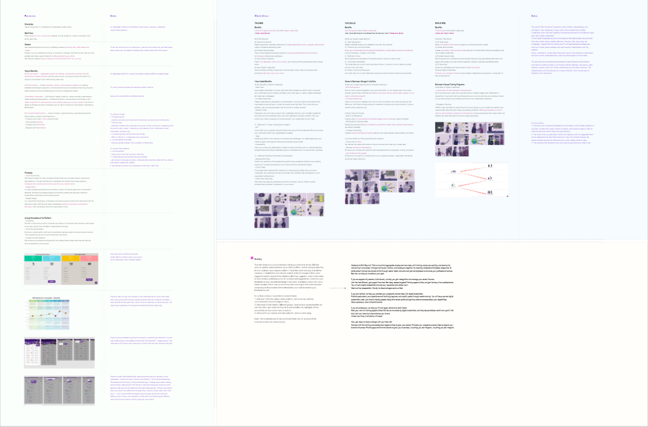
Through an in-depth website analysis, I identified three distinct user groups sharing the same interface, causing overlapping interactions and confusion. Additionally, the crucial Digital Credentials feature was underemphasized. To address these issues, I created a targeted onboarding design to clarify platform offerings for each user group, enhancing understanding and engagement.
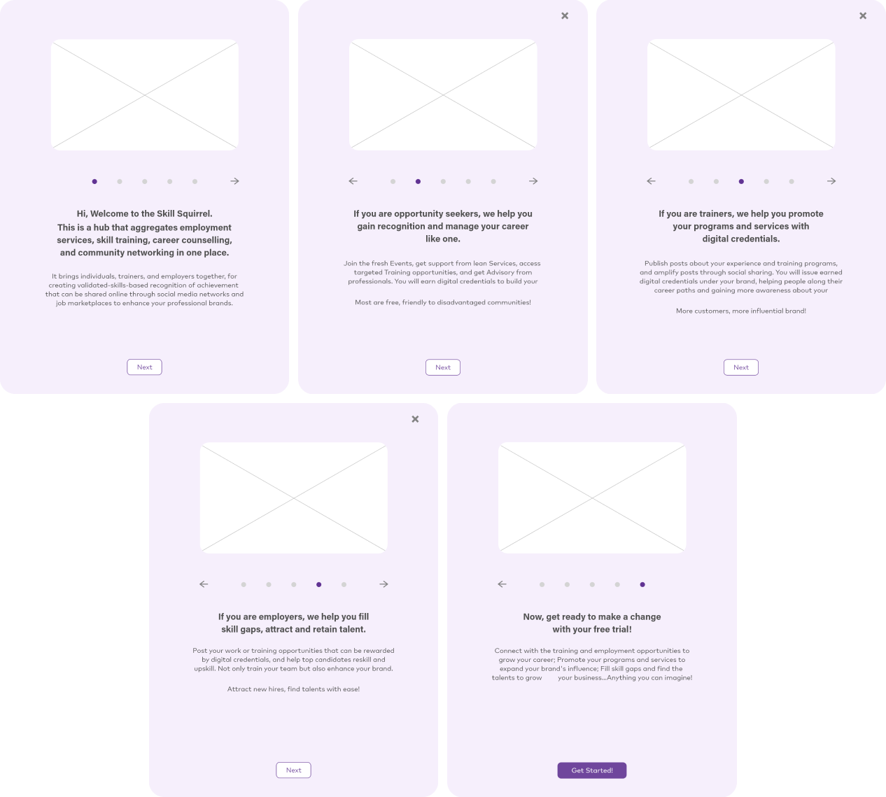
The first artboard highlights Skill Squirrel’s mission, target audience, and fundamental value proposition. Subsequent artboards focus on the specific benefits for three principal user groups, demonstrating how they can effectively engage with the platform’s services and solutions. The final artboard wraps up by summarizing the key advantages, fostering motivation for user engagement.
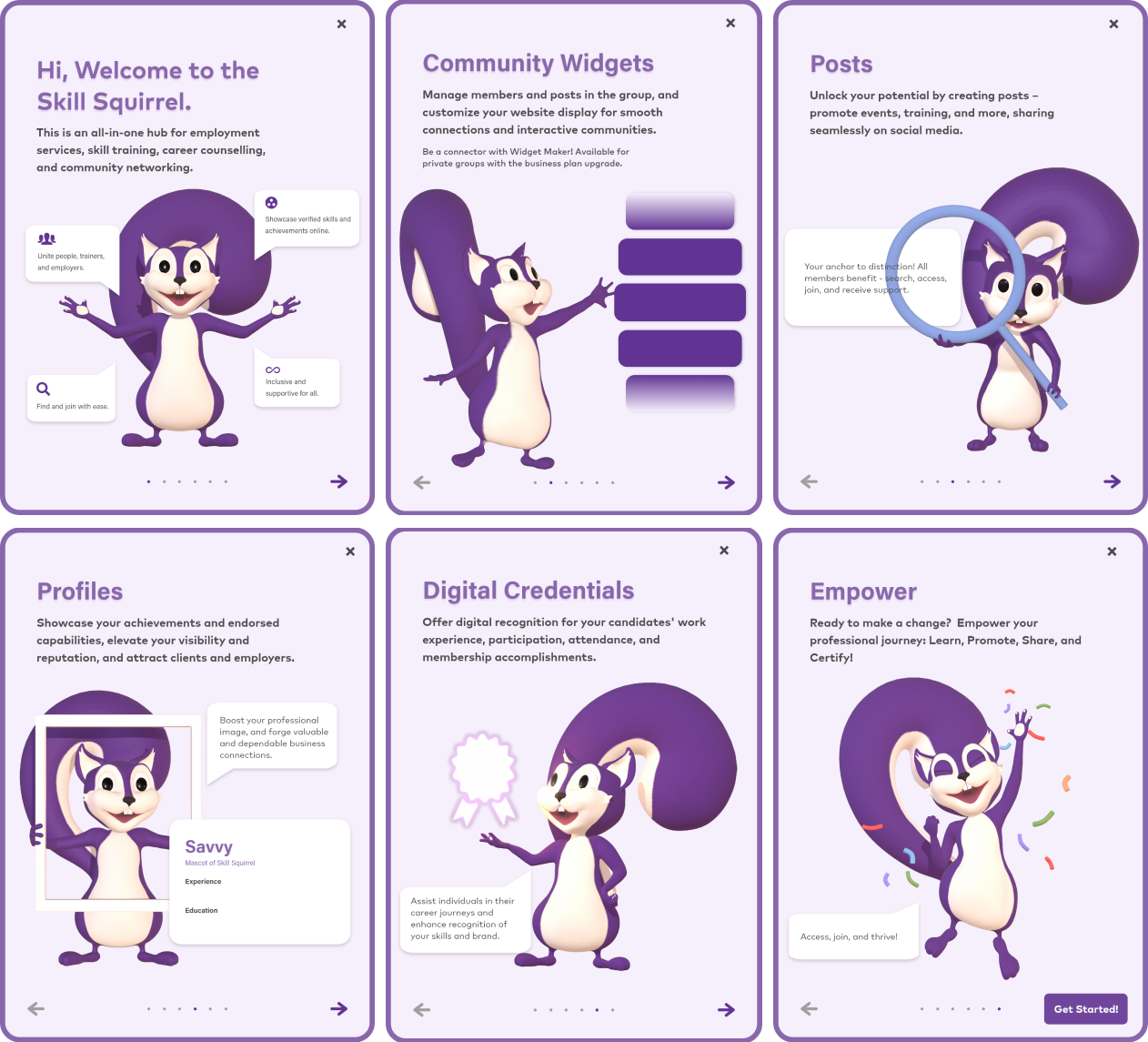
Based on stakeholder feedback, the design was iterated to meet updated expectations. The new pop-up focused on prominently showcasing essential features—Community Widgets, Posts, Profiles, and Digital Credentials—immediately during the user’s first interaction. It aimed to balance feature introduction with actionable guidance on their use and benefits.
04
Reflection
Each project was a lesson in empathy, teaching me to put myself in the users’ shoes to address their unique challenges:
• Simplifying the PDA process highlighted the importance of accessibility and efficiency in reducing friction.
• Redesigning the user account interface emphasized the value of clarity and consistency in creating intuitive experiences.
• Designing the onboarding pop-up underscored the power of engaging visuals and concise messaging to capture user attention and drive engagement.
Partnering with a 3D designer, I refined concepts through feedback, aligned visuals with goals, and balanced functionality, aesthetics, and user needs to deliver cohesive, stakeholder-aligned solutions. This experience enhanced my ability to integrate diverse perspectives and excel in cross-functional collaboration.


