

UX-UI MOBILE DESIGN
Designing a Seamless Scheduling Experience for LunchME Chat
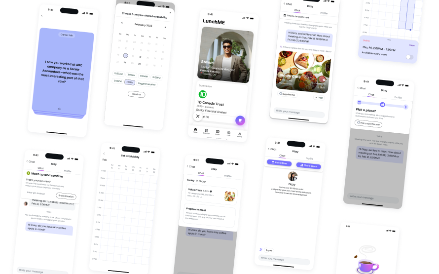
LunchME is a social coffee chat platform designed to help users grow their professional network over shared meals. A key challenge emerged after invitations were accepted: many users stalled in chat interface without moving forward to schedule a meetup. This redesign introduced a lightweight, AI-assisted scheduling flow directly into the chat, reducing friction, speeding up decision-making, and strengthening online-to-offline conversion.
ROLE
Research & Analysis
UX/UI Design
Lead Design Workshop
Design Strategy
Usability Testing
TOOLS
Figma
Figjam
TIMELINE
Jun - Aug 2025
01
Research
We conducted interviews with both senders and invitees to understand their behavioral patterns and discovered that scheduling an actual meetup between strangers required considerable effort to negotiate time, place, and preferences. The original onboarding flow attempted to solve this by asking users to pre-fill their availability. However, the lengthy process caused frustration and high drop-off rates — leading the business to lose users even before they completed registration.
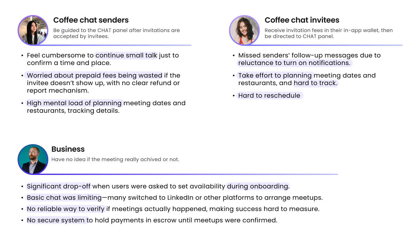
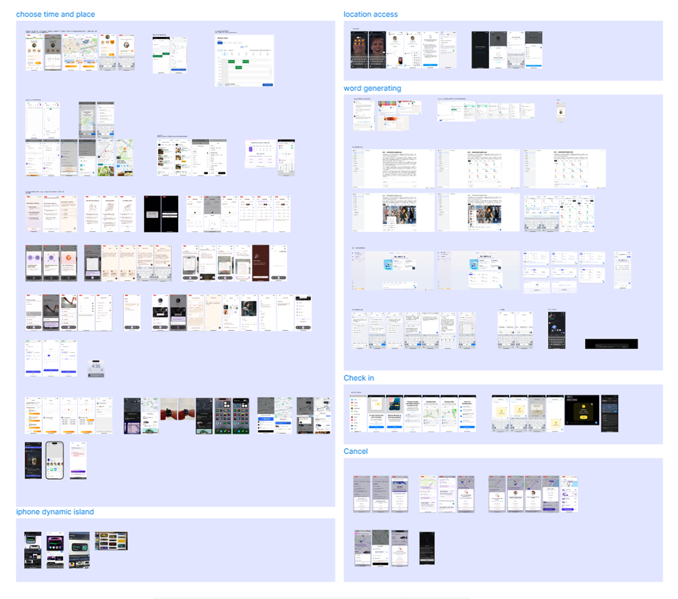
I analyzed leading scheduling tools and social apps to benchmark how users coordinate time and location. Compared with competitors, the current LunchME version revealed several gaps — it lacked visibility into users’ availability, offered limited interactivity within the chat interface, provided minimal guidance during scheduling, and had no AI-powered suggestions to streamline decisions. These insights uncovered opportunities to embed lightweight scheduling directly into the chat flow, reducing cognitive effort and making coordination more effortless.
02
Strategy
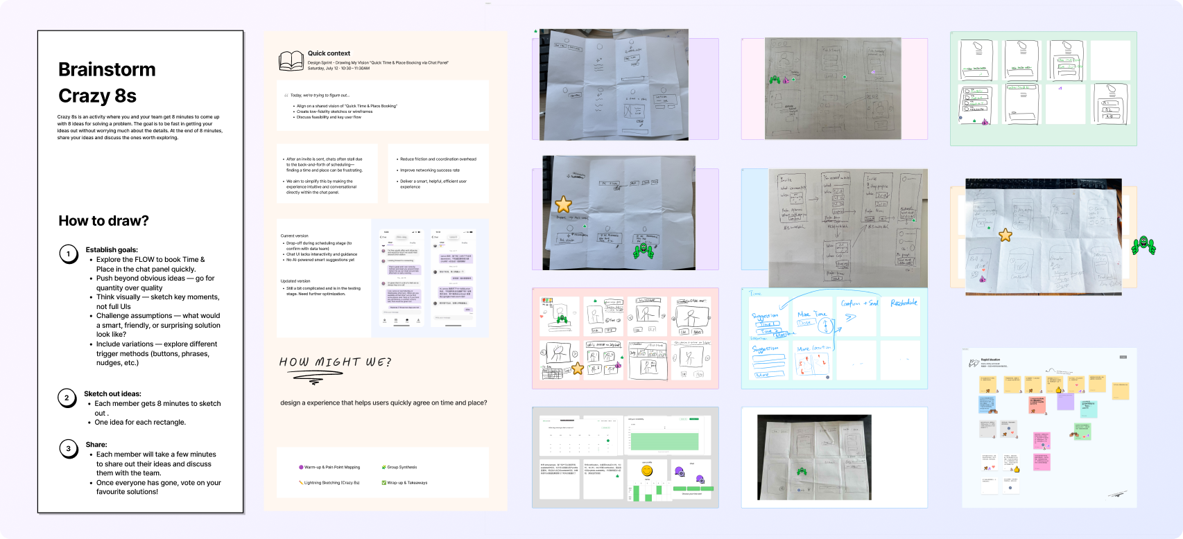
To tackle the friction-heavy scheduling experience, I facilitated a Crazy 8s design workshop to reimagine the “Book Time & Place” flow within chat — turning scheduling from a tedious task into a natural part of the conversation. The sprint generated diverse ideas, including AI-driven conversational scheduling, mutual availability visibility, AI Match for smart coordination, multi-time and location options, one-tap rescheduling, and gamified interactions to make planning more engaging. These explorations inspired a more intelligent and human-centered in-chat scheduling experience.
Using insights from prior research, I mapped end-to-end journeys for two personas — the Sender (initiator) and the Invitee (responder). This mapping revealed emotional highs and lows across each stage, uncovering friction points around time coordination, venue selection, and trust validation. From these insights, I defined key features to address coordination and trust challenges:
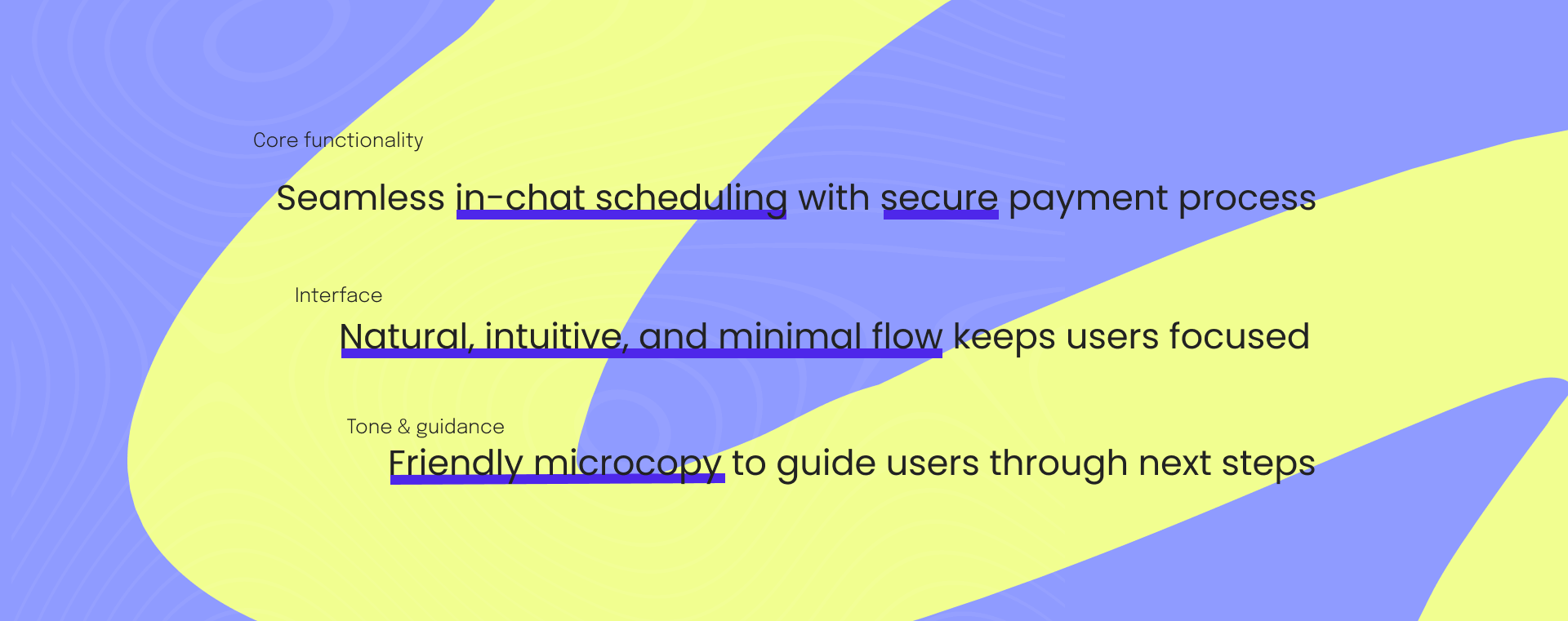
• Smart time coordination — AI-assisted suggestions to reduce negotiation effort
• In-chat scheduling flow — integrate booking of time and place directly within the conversation
• Conversion booster — streamline steps from chat to confirmed meetup
• Trust validation system — transparent and secure check-in and payment process
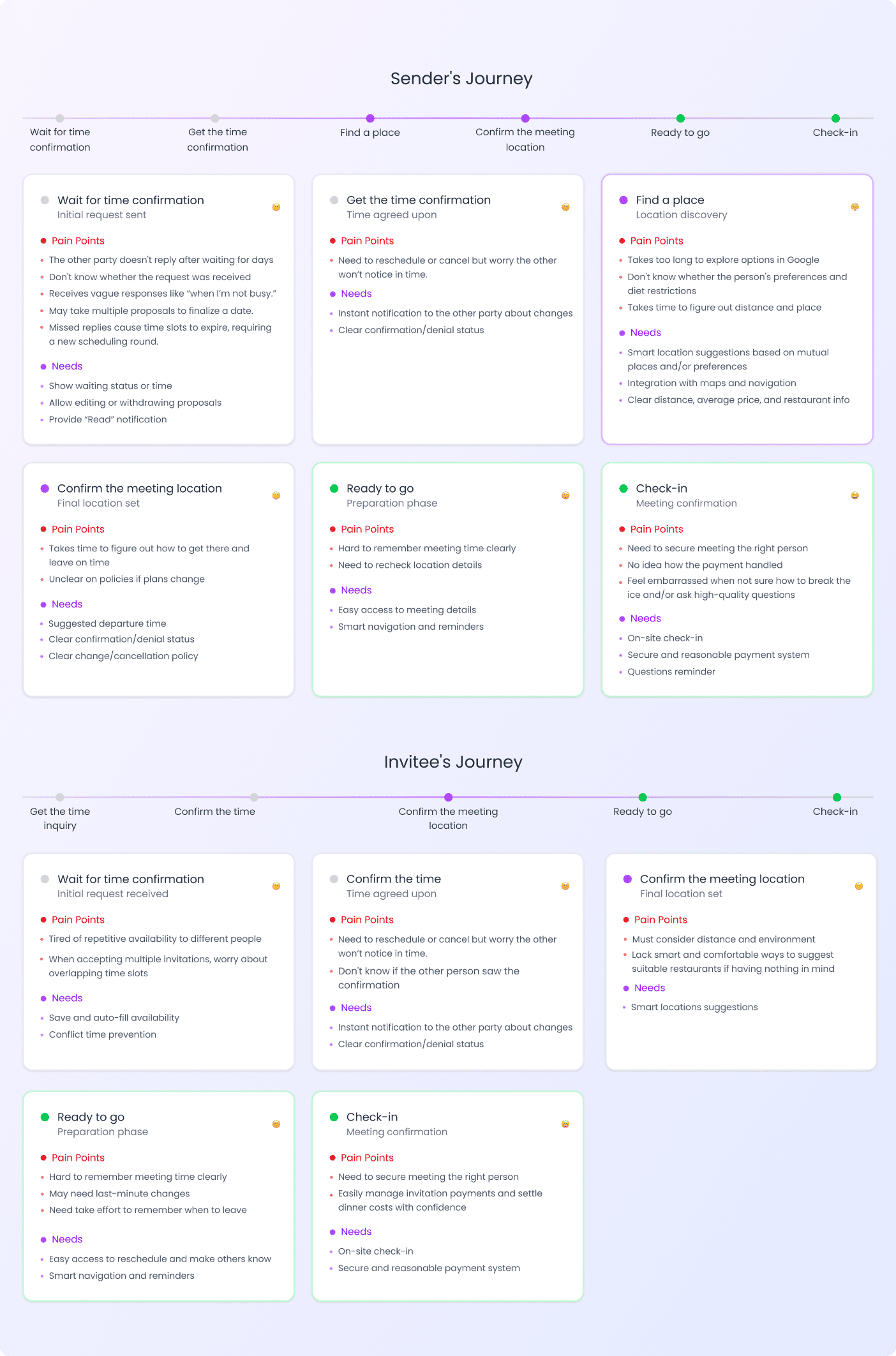
How might we enable quick, in-chat scheduling of time and place to improve the success rate of meaningful meetups?
03
UX/UI Design
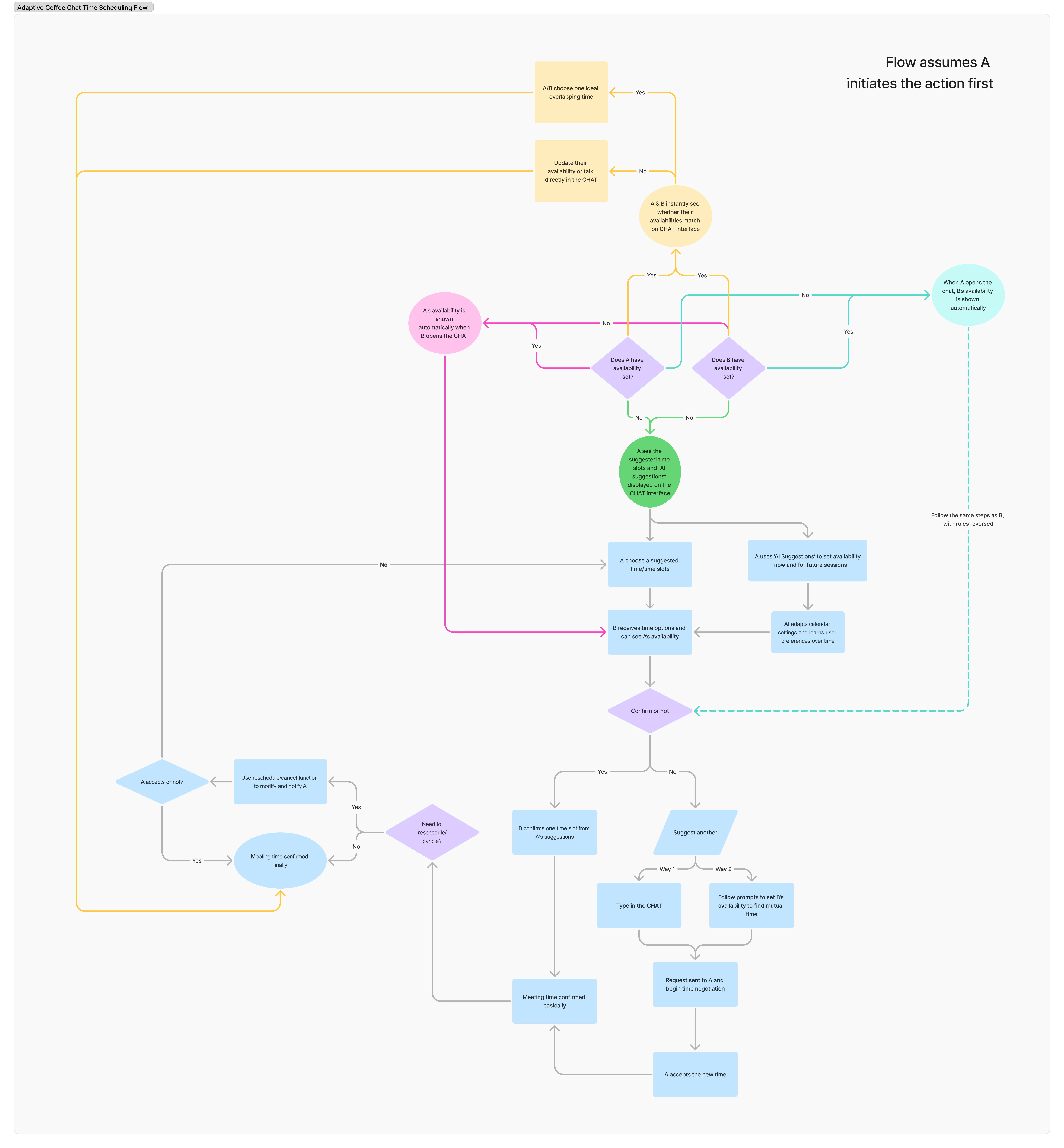
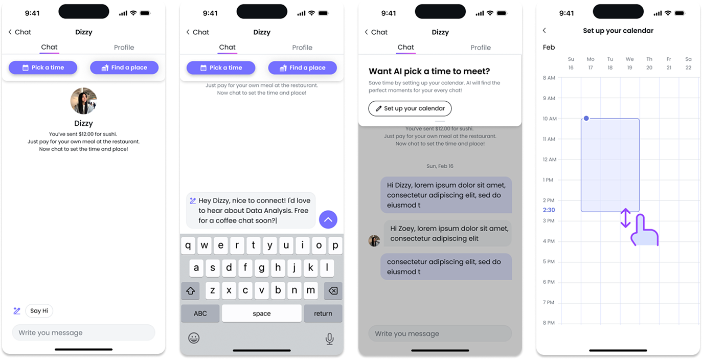
I mapped four interaction flows for (time) scheduling first between Sender (A) and Invitee (B):
• Neither user has set availability
• A has set availability, but B has not
• B has set availability, but A has not
• Both have availability set
Each path dynamically adjusts entry points, prompts, and suggestions to keep users engaged, reduce drop-offs, and promote fairness.
I sketched multiple interaction models — from embedded chat assistants to modular time-picking overlays — and tested these with stakeholders. Through quick feedback cycles, we identified that inline conversational scheduling provided the most intuitive experience while keeping users in the flow of conversation.
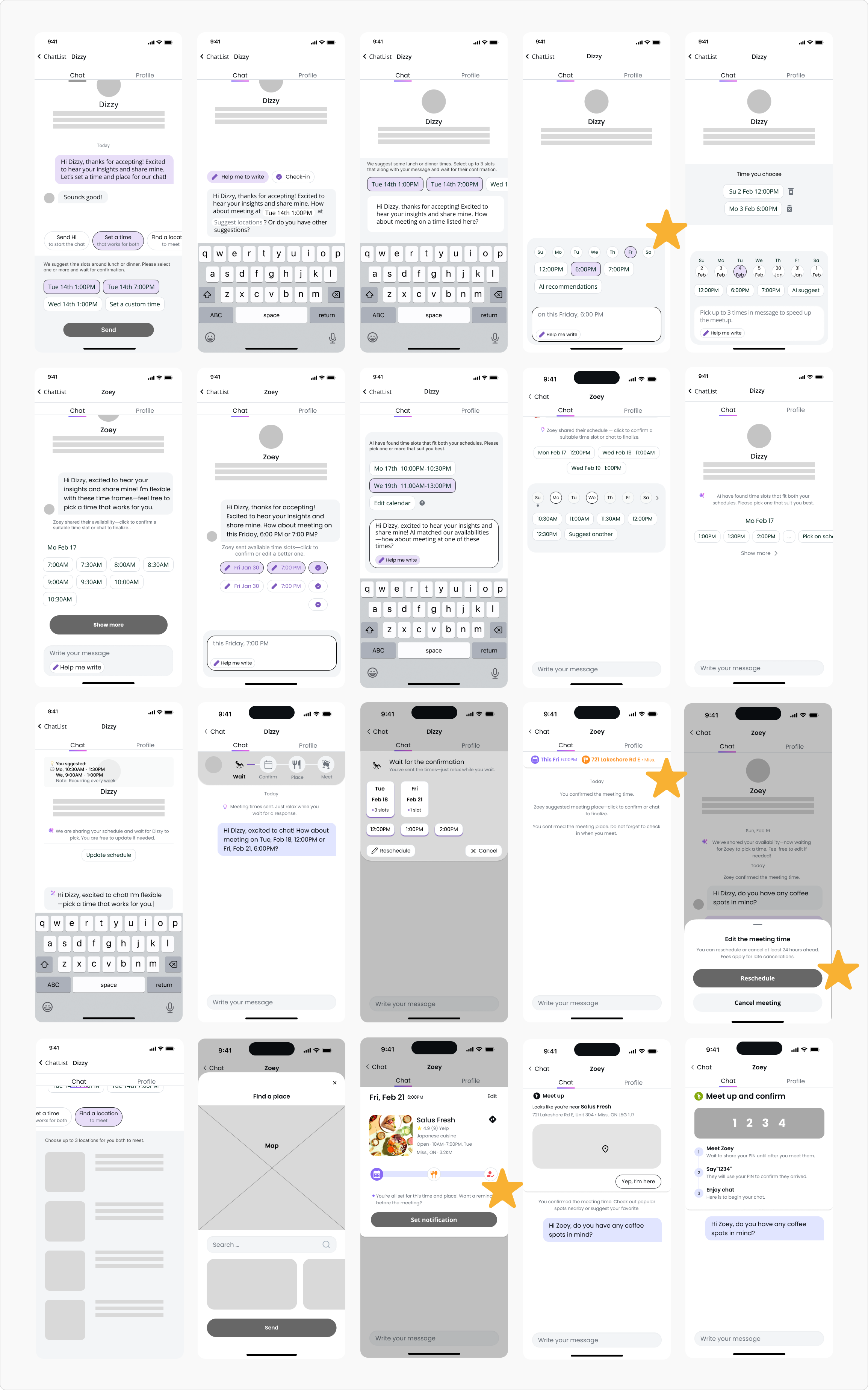
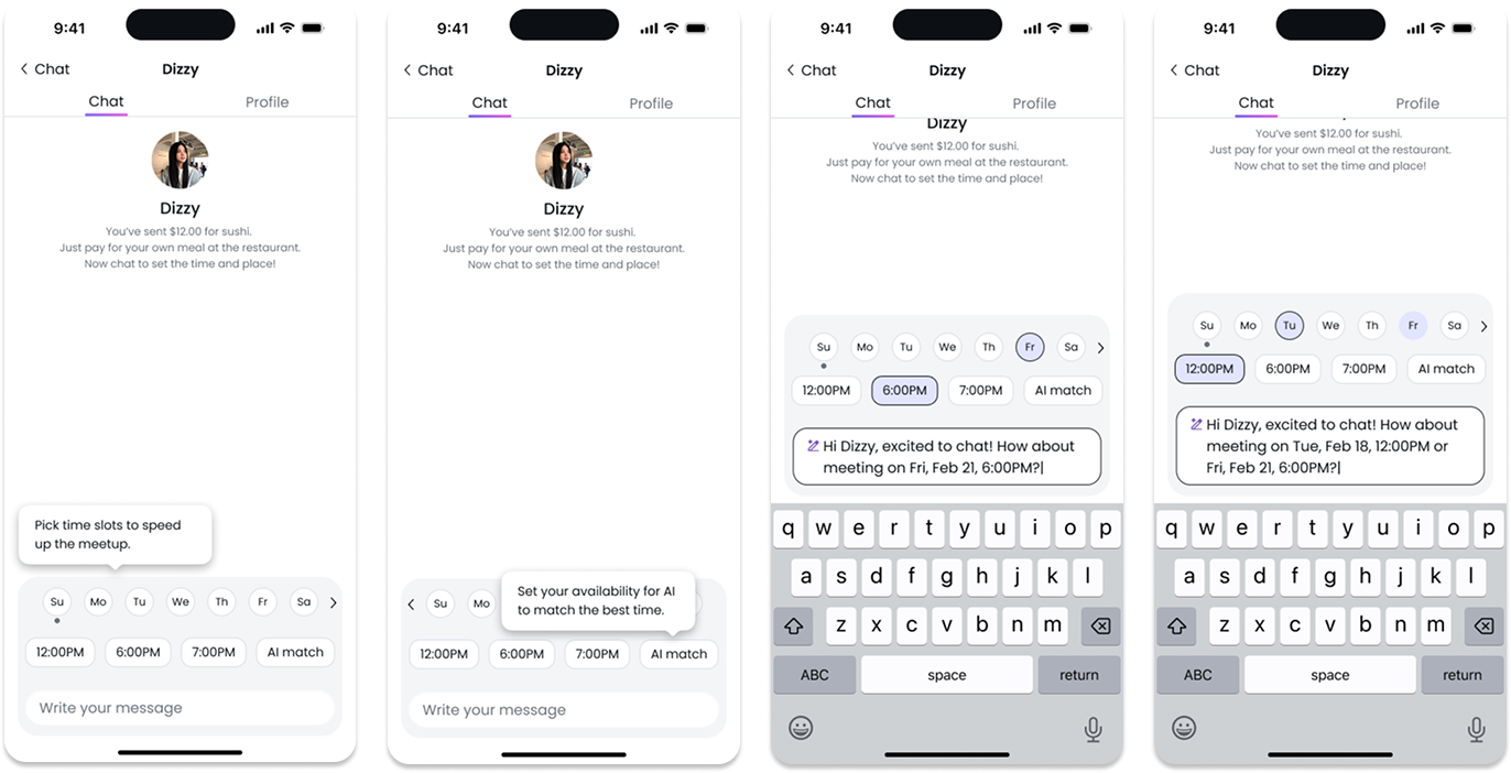
Smart time-slot suggestions appear contextually as users type, turning scheduling into a natural extension of the conversation rather than a separate task. Users can also tap “AI Match” to set their availability and receive smart matches with compatible times for both parties later.
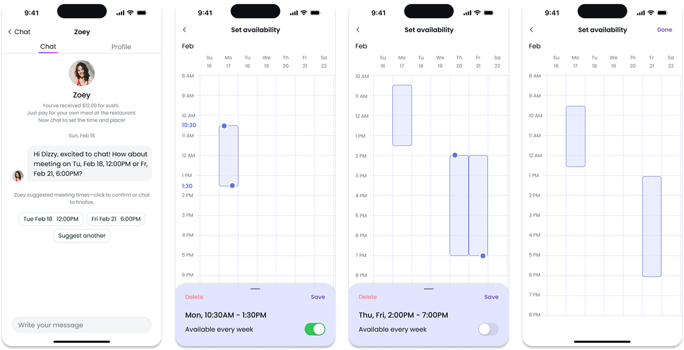
The system learns user preferences to propose optimized time and venue options. Invitees can accept, modify, or propose alternatives via a lightweight calendar.
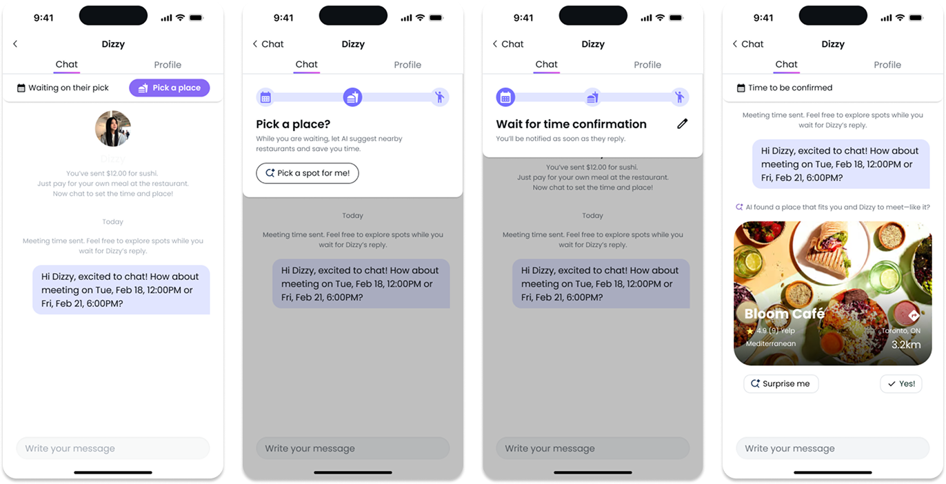
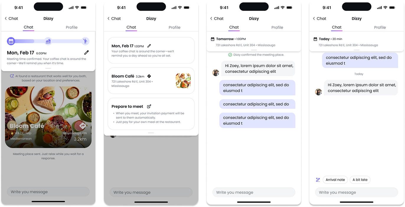
A top tracker clearly visualizes progress — Time → Place → Check-in. As meeting times approach, users receive timely reminders to plan and go. High-contrast visuals improve visibility and accessibility.
Core details stay visible while extended actions (reschedule, cancel, navigation, details) remain collapsible for a clean, focused UI.
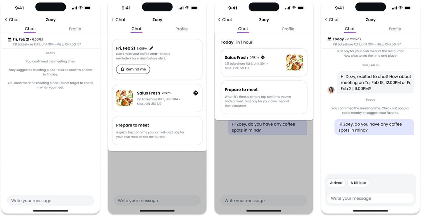
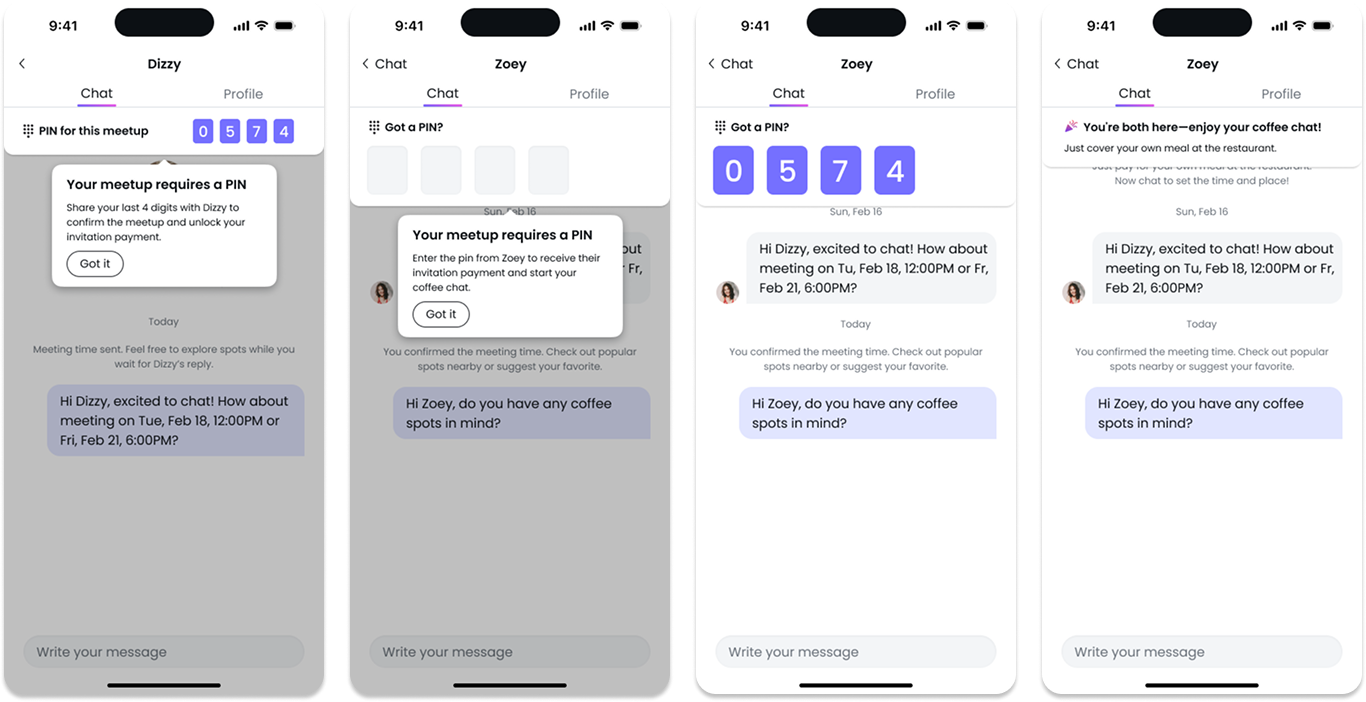
A final GPS-based or PIN input check-in confirms the meetup, ensuring inviatation payment release only when invitees’ attendance is verified.
04
System Design
To ensure a seamless and trustworthy experience, I designed supporting system logics that handle fairness, responsibility, and contextual intelligence behind each interaction. These logics clarify how the app manages cancellations, payments, and recommendations — maintaining transparency and reinforcing user trust.
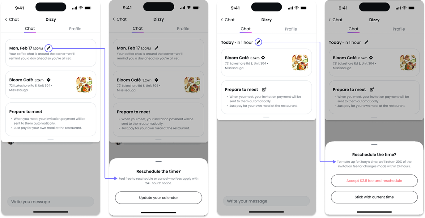
This policy was crafted to balance fairness and convenience for both senders and invitees—minimizing frustration and misuse while promoting accountability. Users can freely reschedule up to 24 hours before the meetup, while late changes incur a small fee to discourage last-minute disruptions.
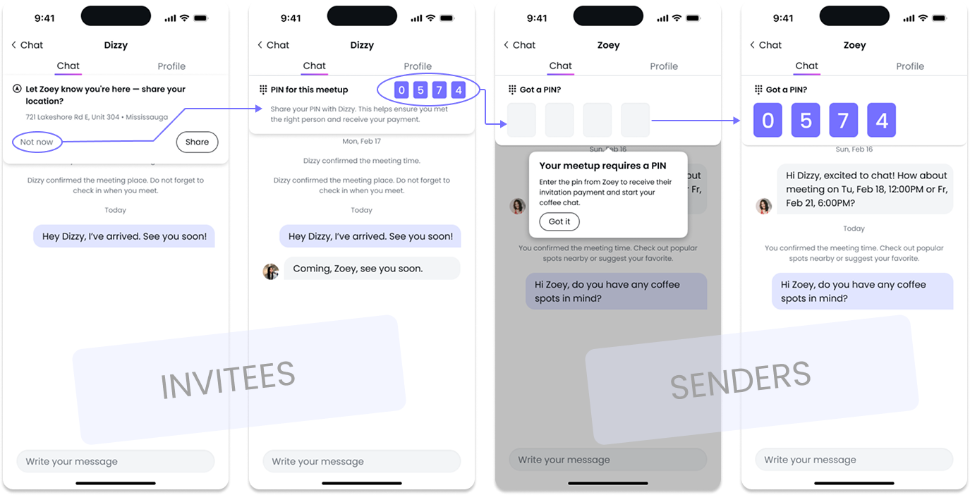
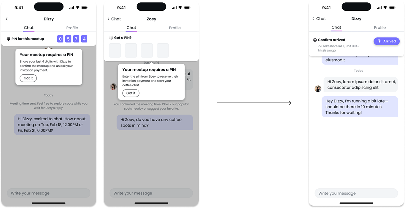
To enhance the sense of security during payment confirmation, I designed a PIN-based verification flow between senders and invitees. If GPS cannot confirm that both parties are at the same or nearby locations (assuming one or both have not enabled location sharing), the system triggers a manual check. At the scheduled meeting time, the invitee provides a unique PIN code to the sender, confirming their arrival. The sender then enters this code to verify presence and release the invitation payment. This interaction mirrors real-world transaction flows, drawing inspiration from proven models like Uber’s PIN verification, and helps clarify accountability between both sides.
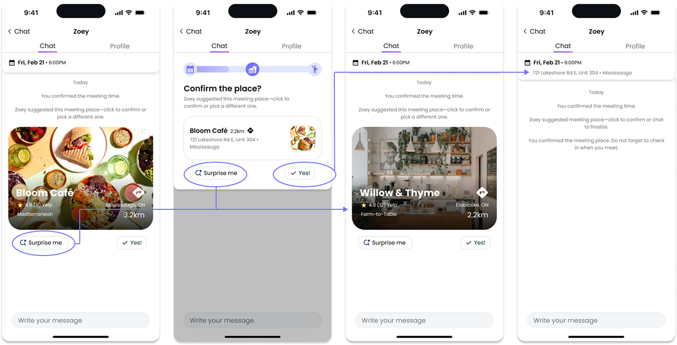
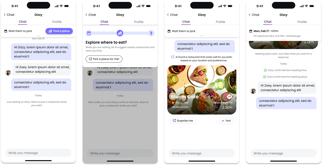
I designed a two-tier location recommendation logic to make AI suggestions feel balanced and human. For cross-city matches, the system suggests “fair” midpoints near major transit hubs; for same-city users, it prioritizes balanced distance, accessibility, and popularity.
To add spontaneity and flexibility, a “Surprise Me” mode reveals one new spot per click from 20 handpicked options—looping if needed, and gently prompting a decision after 25 tries. Future iterations can integrate heat maps and behavioral learning to make recommendations more personalized over time.
05
Test & Iteration
I conducted moderated usability sessions with 10 participants representing both senders and invitees. Findings indicated strong satisfaction with in-chat scheduling efficiency, but surfaced key areas for refinement.
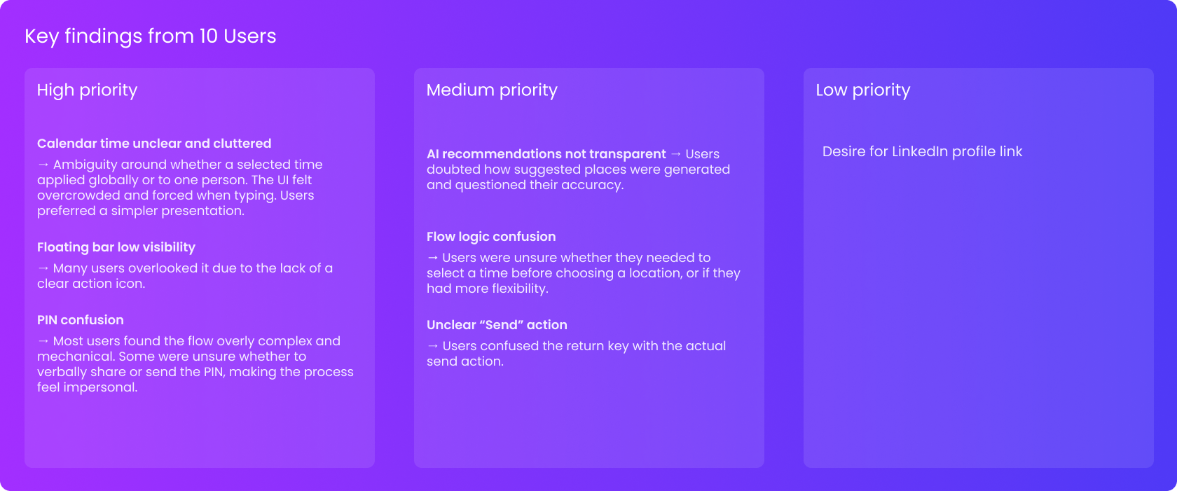
For the AI time suggestions, users found the calendar view restrictive and visually crowded. The “AI Match” label was also unclear, and many users were confused about how to send their responses—expecting a visible button rather than pressing “Return” on the keyboard. To address these, the guidance hints were simplified and positioned above the chat area, the wording clarified, and a prominent send button introduced—making the flow more intuitive and easy to discover.
When testing AI place recommendations, participants expressed a strong desire for control and transparency. They wanted to know how suggested venues were generated and preferred the option to browse manually. The iteration introduced visible reasoning labels (e.g., “based on your past chats” or “midpoint location”) and allowed independent time and place selection, increasing user confidence in AI decisions.
The bar, designed to guide users through the scheduling stages, often went unnoticed during first use. To improve discoverability, it was enlarged, given higher contrast, and equipped with a subtle drag handle—signalling expandability and encouraging interaction.
The arrival check-in process initially relied on a multi-step PIN verification, which felt mechanical and disrupted the flow. It was redesigned into a one-tap “Arrived” action, paired with a lightweight confirmation animation that preserved reliability while feeling faster and more human.
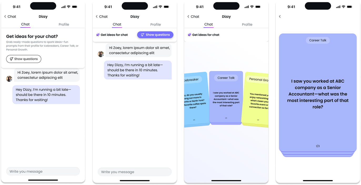
During conversations, some younger users—especially job seekers—felt awkward starting or sustaining discussions. To ease this friction, AI-generated icebreaker prompts and light gamified question cards were added, helping users initiate dialogue more comfortably.
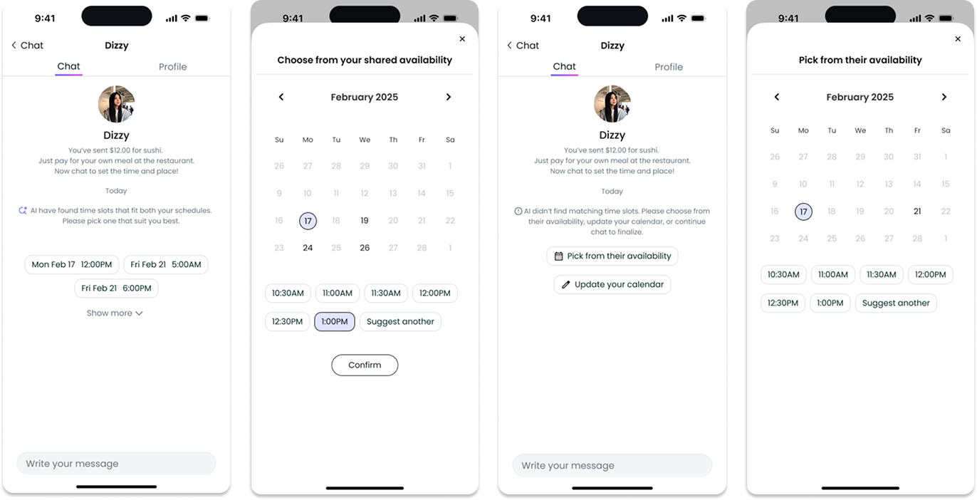
Previously, redundant steps appeared when both users had already shared calendars. The logic was updated to automatically propose overlapping time windows, streamlining coordination and saving effort for both parties.
06
0utcome & Reflection
The new in-chat scheduling experience boosted conversion by embedding coordination directly into the conversation flow, reducing average scheduling time by 30% and increasing confirmed meetups by 32% in the first month. The simplified design also laid the foundation for a data-informed iteration model, enabling continuous improvement in scheduling efficiency and AI recommendation accuracy.
Through designing this end-to-end experience, I reflected on how holistic UX thinking connects product goals, user empathy, and business impact.
• Collaborating closely with stakeholders reinforced the value of early alignment and continuous feedback loops.
• The project underscored the importance of scalable design thinking—balancing rapid iteration with real user needs.
• Moving forward, I plan to expand usability testing to include older and less tech-savvy users to ensure inclusivity.
• I also see strong potential for deeper AI personalization—evolving LunchME into a conversational assistant that proactively manages scheduling with minimal user effort.


